Color contrast is the difference between two colors. In online documents, color contrast refers to the difference between the text color and the background color. It is important to have adequate color contrast to ensure readability of your documents, especially for those with low vision or color blindness. The accessibility checker in Microsoft 365 will not check for adequate color contrast. This requires a manual check.
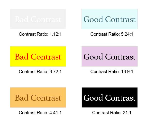
Below are examples of good and bad contrast. A contrast ratio of 4.5:1 and higher is considered accessible.
How do I check color contrast in my Microsoft 365 document?